The Power of Personalization
How I Optimized Wholesale Ordering Experience
The Power of Personalization
How I Optimized Wholesale Ordering Experience
The Power of Personalization
How I Optimized Wholesale Ordering Experience

Overview
JomlahBazar, an online wholesale marketplace
JomlahBazar is an online wholesale marketplace connecting buyers and sellers for bulk trades. Yet, its ordering process was clunky and unoptimized, leading to delays, errors, and frustration. Users struggled to find products, complete orders, and manage transactions efficiently.
As the product designer, I collaborated with the product manager and marketing team to resolve ordering issues. Using targeted user research and data insights, I pinpointed friction points and developed design solutions that improved usability and tailored the experience for all users.
Industry
Online Wholesale Marketplace
Duration
6 weeks
Role
Product Designer
Responsibilities
Interaction Design, Visual Design, Motion Design, UX Research, UX Writing
Industry
Online Wholesale Marketplace
Duration
6 weeks
Role
Product Designer
Responsibilities
Interaction Design, Visual Design, Motion Design, UX Research, UX Writing
Industry
Online Wholesale Marketplace
Duration
6 weeks
Role
Product Designer
Responsibilities
Interaction Design, Visual Design, Motion Design, UX Research, UX Writing
Problem
Unoptimized ordering drives low conversions and frustration
Problem
Unoptimized ordering drives low conversions and frustration
Problem
Unoptimized ordering drives low conversions and frustration
About the problem
JomlahBazar’s ordering process suffered from inefficient design and confusing navigation. Cluttered layouts and disorganized listings left users struggling to complete orders swiftly.
About the problem
JomlahBazar’s ordering process suffered from inefficient design and confusing navigation. Cluttered layouts and disorganized listings left users struggling to complete orders swiftly.
About the problem
JomlahBazar’s ordering process suffered from inefficient design and confusing navigation. Cluttered layouts and disorganized listings left users struggling to complete orders swiftly.
Why it matters
An unoptimized ordering system frustrates users and erodes trust, slowing revenue growth. Inefficiencies during checkout lead to lost sales and weaken the marketplace’s competitive position.
Why it matters
An unoptimized ordering system frustrates users and erodes trust, slowing revenue growth. Inefficiencies during checkout lead to lost sales and weaken the marketplace’s competitive position.
Why it matters
An unoptimized ordering system frustrates users and erodes trust, slowing revenue growth. Inefficiencies during checkout lead to lost sales and weaken the marketplace’s competitive position.


Empathize
Understanding the user’s journey through research
Empathize
Understanding the user’s journey through research
Empathize
Understanding the user’s journey through research
Analyzing heatmaps: to uncover user behavior
By analyzing heatmaps, I uncovered precise patterns of user interaction on JomlahBazar. The visual data revealed hotspots and areas of neglect, highlighting which elements attracted attention and which were overlooked. This insight guided my focus on optimizing critical interface components.
Reviewing recordings: to observe real-world usage
I reviewed session recordings to observe how users navigated the marketplace in real time. These recordings exposed stumbling points in the ordering journey, revealing hesitations, repeated actions, and missed cues. The real-world usage data was invaluable for validating design improvements.
Conducting usability tests: to validate assumptions
Conducting targeted usability tests, I gathered direct feedback on the ordering process. Participants highlighted navigation challenges and unclear calls-to-action. Their insights validated my assumptions and informed iterative refinements to create a more intuitive, efficient marketplace experience.
Pain Points
Uncovering the underlying root causes of user frustration
Pain Points
Uncovering the underlying root causes of user frustration
Pain Points
Uncovering the underlying root causes of user frustration
Usability issues across key pages
Users faced significant usability challenges due to inconsistent layouts and unclear navigation across the platform. Confusing menus and scattered information made it difficult to locate products and complete orders, often resulting in deep frustration and interrupted purchasing journeys.
Clutter and chaos on the homepage overwhelming sellers
The homepage was cluttered with excessive content, overwhelming sellers with irrelevant product listings and a lack of personalized recommendations. This chaotic display hindered quick decision-making and led to disengagement as users struggled to focus on items that truly mattered.
Missed notifications about deals and important updates
Users frequently missed vital notifications about deals, order updates, and critical alerts due to a disorganized alert system. This gap in communication led to missed opportunities, severely undermined trust, and left users feeling disconnected from a platform they relied on.
Usability issues across key pages
Users faced significant challenges with inconsistent layouts, unclear navigation paths, and inefficient tools. These issues created confusion and made it difficult for users to complete their tasks effectively. The lack of a cohesive design language across pages added to the frustration, as users had to constantly adapt to different interfaces. This inconsistency not only slowed down their workflow but also led to a disjointed and unsatisfying experience that needed to be addressed.
Clutter and chaos on the homepage overwhelming sellers
The homepage was overloaded with content, displaying all available products without any personalization. This lack of focus overwhelmed users, particularly sellers who were only interested in specific categories. Instead of helping users quickly find what they needed, the cluttered design made it harder for them to identify relevant products or opportunities. As a result, engagement dropped, and users struggled to connect with the platform in a meaningful way.
Lack of peer interaction impacts engagement
Users frequently missed important notifications, such as deals, order updates, or other critical information, due to the absence of a proper notification management system. This lack of visibility not only caused users to miss out on valuable opportunities but also reduced their overall engagement with the platform. Without a reliable way to stay informed, users felt disconnected and less motivated to interact with the system regularly.
Ideate
Unlocking creative solutions with HMW questions
Ideate
Unlocking creative solutions with HMW questions
Ideate
Unlocking creative solutions with HMW questions

Tap to change card


Tap to change card
Tap to change card
Exploring opportunities through structured brainstorming
Using the How Might We framework, I led brainstorming sessions that unlocked creative ideas addressing user frustrations. This process transformed pain points into actionable design strategies focused on personalization and a streamlined, efficient ordering experience.
Solutions
Addressing user pain points with targeted solutions
Solutions
Addressing user pain points with targeted solutions
Solutions
Addressing user pain points with targeted solutions
Resolving usability issues across key pages
To tackle usability challenges, I overhauled key pages by implementing consistent layouts and intuitive navigation. Streamlined menus and reorganized information empowered users to locate products and complete orders with ease. This approach reduced friction and enhanced the ordering flow.
Personalizing the homepage to enhance relevance
To address homepage clutter, I introduced personalization by tailoring content to each user’s unique preferences. Focused layouts and curated product recommendations minimized visual noise and enabled users to quickly find essential items, thereby boosting engagement. This raised engagement.
Implementing a notification management system
To ensure users received timely updates, I implemented a robust notification management system. By enabling customized alert preferences and prioritizing critical order and deal notifications, the system kept users informed and engaged, reducing missed opportunities significantly.
Resolving usability issues across key pages
To address usability challenges, the focus was on creating consistent layouts, clear navigation paths, and efficient tools. By standardizing design elements and streamlining interactions, the goal was to reduce friction and enable users to complete tasks more effectively. This approach aimed to create a seamless experience that aligned with user expectations and improved overall satisfaction.
Personalizing the homepage to enhance relevance
The proposed solution for the cluttered homepage involved introducing personalization based on user preferences. By gathering insights into each user’s business needs, the homepage would display only the most relevant products and content. This approach aimed to reduce overwhelm, improve focus, and increase engagement by delivering a tailored experience for each user.
Implementing a notification management system
To ensure users stayed informed about critical updates, a notification management system was proposed. This system would allow users to customize their preferences and receive timely, relevant updates. By leveraging personalization data, notifications could be targeted to individual needs, ensuring users never missed important information while maintaining a clutter-free experience.
Planning
Prioritizing solutions with the impact-effort matrix
Planning
Prioritizing solutions with the impact-effort matrix
Planning
Prioritizing solutions with the impact-effort matrix

Fixing usability issues for quick wins
I prioritized quick wins by first addressing usability issues, optimizing navigation and filters to streamline the ordering process.
Fixing usability issues for quick wins
I prioritized quick wins by first addressing usability issues, optimizing navigation and filters to streamline the ordering process.
Fixing usability issues for quick wins
I prioritized quick wins by first addressing usability issues, optimizing navigation and filters to streamline the ordering process.
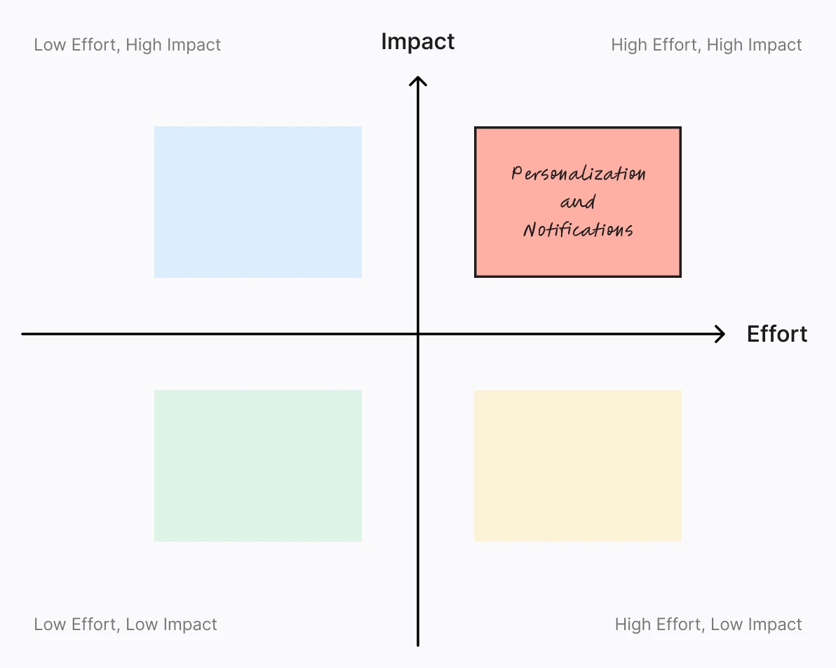
Personalization and notifications
I planned a later phase to refine personalization and enhance notifications, creating a scalable solution for sustained engagement.
Personalization and notifications
I planned a later phase to refine personalization and enhance notifications, creating a scalable solution for sustained engagement.
Personalization and notifications
I planned a later phase to refine personalization and enhance notifications, creating a scalable solution for sustained engagement.
Design
Resolving usability issues through thoughtful improvements
Design
Resolving usability issues through thoughtful improvements
Design
Resolving usability issues through thoughtful improvements
Transforming the filter icon into a dedicated filter bar for better accessibility
To improve usability, I replaced the tiny filter icon with a full-width filter bar located above the product list. This redesign provided immediate access to options such as brand, price, and category, enabling users to swiftly narrow down search results and enhance their browsing experience.
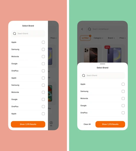
Moving filters to a bottom sheet for better thumb zone accessibility
Recognizing mobile users’ needs, I moved the filtering options from a side menu to a bottom sheet that aligns with ergonomic thumb zones. This repositioning made filters more accessible on mobile devices, streamlining interactions and reducing the time required to refine product searches.
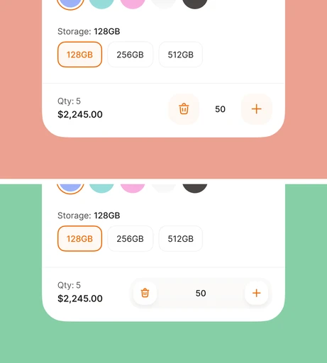
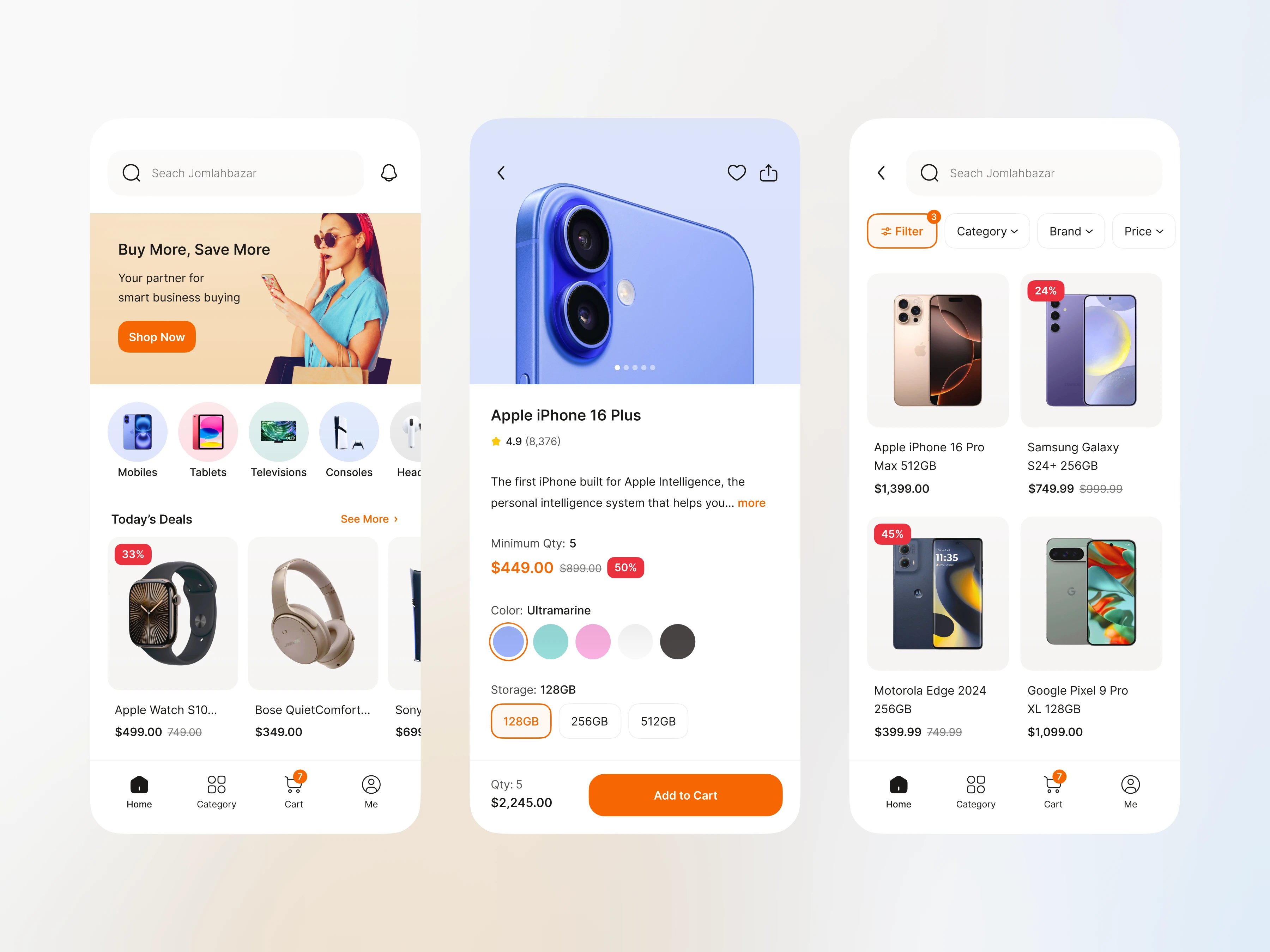
Introducing an input field for precise quantity adjustments on single product pages
To streamline bulk ordering, I integrated an input field between the plus and minus buttons on product pages. This feature lets users enter the desired quantity directly, eliminating repetitive taps and ensuring accurate orders, thereby boosting efficiency and satisfaction.
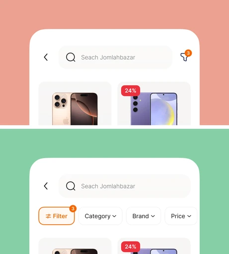
Transforming the filter icon into a dedicated filter bar for better accessibility
The existing filter icon was replaced with a prominent filter bar located above the product list. This change provided users with immediate access to key filters such as brand, price, or category, eliminating the need for additional clicks. By streamlining the filtering process, the new design significantly improved efficiency and made it easier for users to refine their results.
Moving filters to a bottom sheet for better thumb zone accessibility
To enhance mobile usability, the filter structure was redesigned and moved from a side menu to a bottom sheet. This decision was driven by research into thumb zone accessibility, ensuring that users could interact with filters more comfortably and naturally on mobile devices. The new placement aligned with ergonomic principles, making the filtering process faster and more user-friendly.
Introducing an input field for precise quantity adjustments on single product pages
On single product pages, an input field was added between the plus and minus buttons to streamline the process of setting order quantities. Previously, users had to repeatedly tap the plus button to reach their desired quantity, which was especially cumbersome for bulk orders. The new input field allowed users to directly type their desired quantity, saving time and effort while enhancing the precision and efficiency of the ordering process.
Test
Validating solutions through usability testing
Test
Validating solutions through usability testing
Test
Validating solutions through usability testing
Before Test
Usability Test
After Test


Before Test
Usability Test
After Test
Before
Test
After
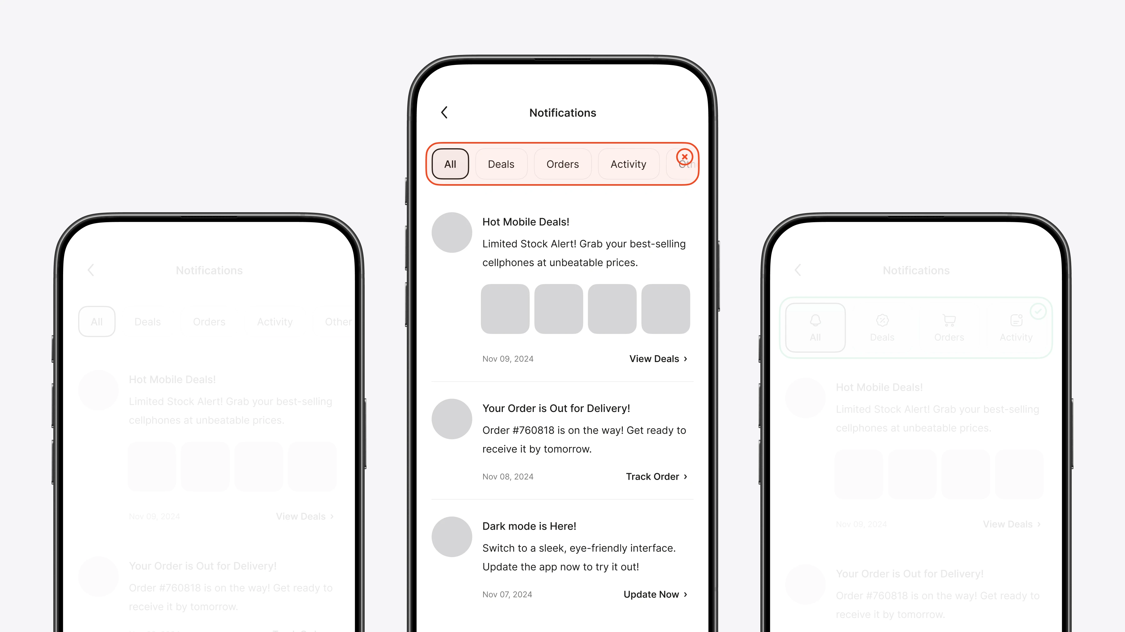
Iterating on notification filter design based on user feedback
During testing, I refined the notification filter by improving visual cues and simplifying the layout. Feedback showed that better categorization enhanced usability, so I modified the design to make critical updates quickly accessible.
Iterating on notification filter design based on user feedback
During testing, I refined the notification filter by improving visual cues and simplifying the layout. Feedback showed that better categorization enhanced usability, so I modified the design to make critical updates quickly accessible.
Iterating on notification filter design based on user feedback
During testing, I refined the notification filter by improving visual cues and simplifying the layout. Feedback showed that better categorization enhanced usability, so I modified the design to make critical updates quickly accessible.
Final Design
The final design: Delivering an optimized user experience
Final Design
The final design: Delivering an optimized user experience
Final Design
The final design: Delivering an optimized user experience
Optimized wholesale ordering experience
The final design unified the ordering experience through intuitive navigation, streamlined filters, and personalized content. This overhaul enabled users to complete orders swiftly and with confidence.
Optimized wholesale ordering experience
The final design unified the ordering experience through intuitive navigation, streamlined filters, and personalized content. This overhaul enabled users to complete orders swiftly and with confidence.
Optimized wholesale ordering experience
The final design unified the ordering experience through intuitive navigation, streamlined filters, and personalized content. This overhaul enabled users to complete orders swiftly and with confidence.

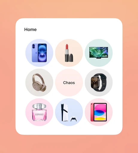
Home Page
Designed a personalized homepage that displayed relevant products based on user preferences.
Home Page
Designed a personalized homepage that displayed relevant products based on user preferences.

Product List
Added a filter bar above the product list for quicker refinement and easier product discovery.
Product List
Added a filter bar above the product list for quicker refinement and easier product discovery.

Personalization Setup
Introduced a simple setup flow for personalization, allowing users to define their business needs.
Personalization Setup
Introduced a simple setup flow for personalization, allowing users to define their business needs.

Single Product Page
Simplified bulk ordering and product details for quicker adjustments and more efficient access.
Single Product Page
Simplified bulk ordering and product details for quicker adjustments and more efficient access.
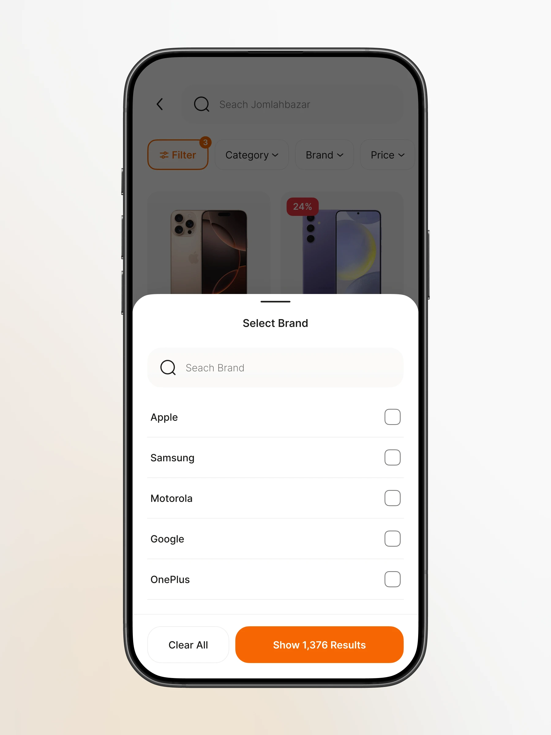
Filter Menu
Redesigned the filter menu as a bottom sheet for better accessibility, aligning with mobile thumb zones.
Filter Menu
Redesigned the filter menu as a bottom sheet for better accessibility, aligning with mobile thumb zones.
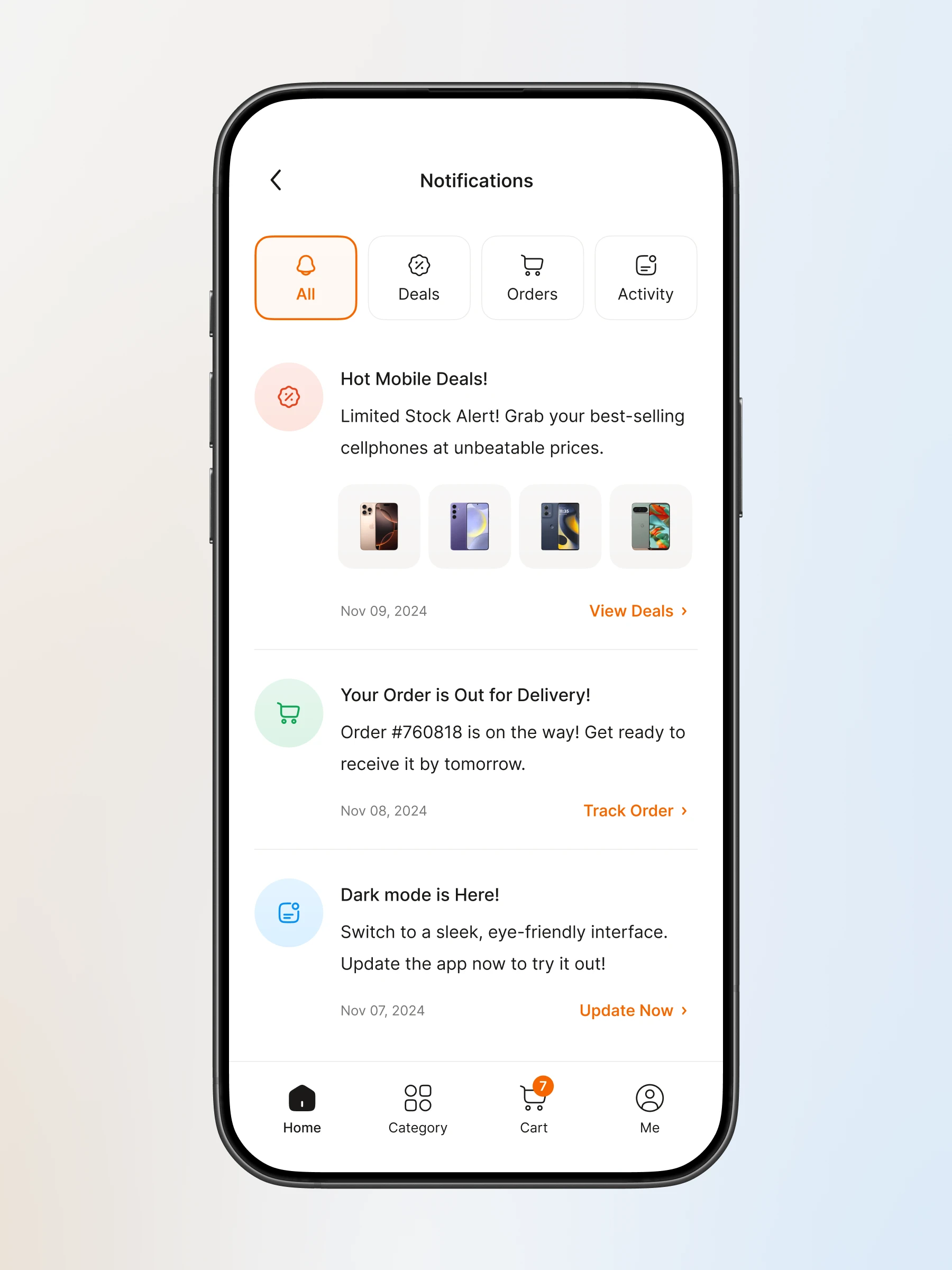
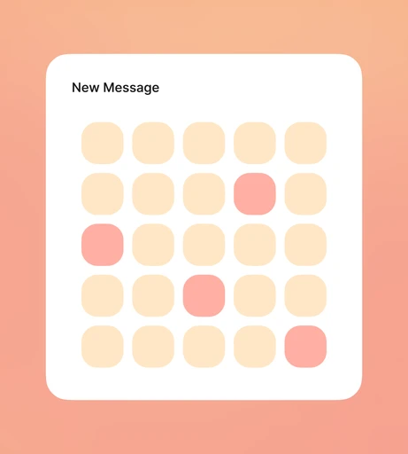
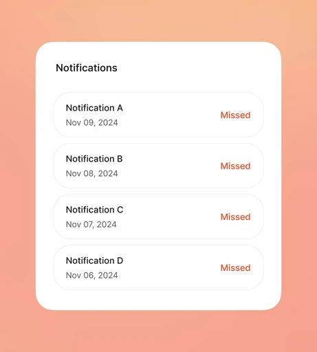
Notification Page
Designed a notification management system with clear categorization, ensuring users never miss important deals.
Notification Page
Designed a notification management system with clear categorization, ensuring users never miss important deals.
Home Page
While the second centered on building the community feature.
Home Page
While the second centered on building the community feature.
Home Page
While the second centered on building the community feature.
Home Page
While the second centered on building the community feature.
Home Page
While the second centered on building the community feature.
Home Page
While the second centered on building the community feature.
Home Page
While the second centered on building the community feature.
Home Page
While the second centered on building the community feature.
Home Page
While the second centered on building the community feature.
Home Page
While the second centered on building the community feature.
Home Page
While the second centered on building the community feature.
Home Page
While the second centered on building the community feature.
Impact
The power of personalization in an online wholesale marketplace
Impact
The power of personalization in an online wholesale marketplace
Impact
The power of personalization in an online wholesale marketplace
Improved order conversion rate
0
0
%
Order conversion rate increased by 23%, reflecting a smoother and more engaging experience.
Increased average order value
0
0
%
Increased average order value by 17%, driving higher revenue per transaction.

