From Consistency To Efficiency
How I Created a Scalable Design System
From Consistency To Efficiency
How I Created a Scalable Design System
From Consistency To Efficiency
How I Created a Scalable Design System

Overview
SaderatBank, a company in personal banking and financial services
SaderatBank delivers a broad range of personal banking and financial services across digital channels. However, lacking a unified design system led to inconsistent visuals and inefficient workflows, which compromised user satisfaction and slowed our pace of innovation.
As the product designer, I embraced the challenge of building a scalable design system. Working closely with cross‑functional teams, I established a unified visual language that improved collaboration, streamlined workflows, and enabled rapid scalability across all digital products.
Industry
Personal Banking and Financial Services
Duration
8 weeks
Role
Product Designer
Responsibilities
Interaction Design, Visual Design, Motion Design, UX Research, UX Writing
Industry
Personal Banking and Financial Services
Duration
8 weeks
Role
Product Designer
Responsibilities
Interaction Design, Visual Design, Motion Design, UX Research, UX Writing
Industry
Personal Banking and Financial Services
Duration
8 weeks
Role
Product Designer
Responsibilities
Interaction Design, Visual Design, Motion Design, UX Research, UX Writing
Problem
Inconsistent designs and inefficient workflows were costing SaderatBank
Problem
Inconsistent designs and inefficient workflows were costing SaderatBank
Problem
Inconsistent designs and inefficient workflows were costing SaderatBank


About the problem
SaderatBank’s digital channels, developed by separate teams, suffered from fragmented visuals and duplicated efforts. This lack of cohesion confused users and slowed our development cycles, hindering our ability to swiftly adapt to market demands.
About the problem
SaderatBank’s digital channels, developed by separate teams, suffered from fragmented visuals and duplicated efforts. This lack of cohesion confused users and slowed our development cycles, hindering our ability to swiftly adapt to market demands.
About the problem
SaderatBank’s digital channels, developed by separate teams, suffered from fragmented visuals and duplicated efforts. This lack of cohesion confused users and slowed our development cycles, hindering our ability to swiftly adapt to market demands.
Why it matters
Inconsistent design undermines brand trust and wastes valuable time, while inefficient workflows delay product launches. For a competitive bank, unifying our digital experience is essential to drive growth, boost customer loyalty, and maintain market leadership.
Why it matters
Inconsistent design undermines brand trust and wastes valuable time, while inefficient workflows delay product launches. For a competitive bank, unifying our digital experience is essential to drive growth, boost customer loyalty, and maintain market leadership.
Why it matters
Inconsistent design undermines brand trust and wastes valuable time, while inefficient workflows delay product launches. For a competitive bank, unifying our digital experience is essential to drive growth, boost customer loyalty, and maintain market leadership.
Pain Points
The underlying challenges in design and collaboration
Pain Points
The underlying challenges in design and collaboration
Pain Points
The underlying challenges in design and collaboration
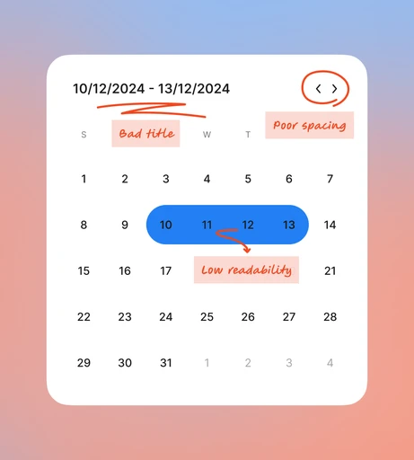
Lack of visual consistency across products
Each digital product exhibited its own distinct colors, fonts, and icon styles, resulting in a disjointed user experience. This fragmented visual language confused customers and diluted our brand identity, ultimately impairing user confidence in SaderatBank.
Poor usability in existing components
Outdated and unintuitive UI components—from buttons to navigation menus—disrupted the user journey. These inconsistencies increased task completion times and generated frustration during critical interactions such as account management and funds transfers.
Poor usability in existing components
Outdated and unintuitive UI components—from buttons to navigation menus—disrupted the user journey. These inconsistencies increased task completion times and generated frustration during critical interactions such as account management and funds transfers.
Absence of documentation led to confusion
Without a centralized source of truth, our design and development teams repeated work and miscommunicated on component usage. This lack of comprehensive documentation resulted in errors, project delays, and overall reduced product quality.
Absence of documentation led to confusion
Without a centralized source of truth, our design and development teams repeated work and miscommunicated on component usage. This lack of comprehensive documentation resulted in errors, project delays, and overall reduced product quality.
Lack of visual consistency across products
SaderatBank’s digital products suffered from a lack of visual harmony. Each product had its own set of colors, typography styles, and iconography, leading to a fragmented user experience. Users encountered different visual languages depending on the platform they used, which created confusion and diluted the bank’s professional image. The absence of a unified visual language made it difficult for customers to associate all products with a single, cohesive brand.
Poor usability in existing components
Many of the components used across SaderatBank’s platforms were outdated and lacked proper usability considerations. Buttons, input fields, and navigation menus often felt unintuitive, making it harder for users to complete tasks efficiently. These usability gaps led to frustration, especially during critical workflows like managing accounts or transferring funds. The overall user experience was negatively impacted, resulting in higher abandonment rates and lower customer satisfaction.
Absence of documentation led to confusion
Without clear documentation for the existing components, designers, developers, and other team members often found themselves unsure about how to implement or reuse elements consistently. This lack of clarity led to redundant work, miscommunication, and inconsistent implementations across different teams and projects. The absence of a single source of truth slowed down development cycles and increased the risk of errors, ultimately affecting both efficiency and quality.
Solutions
Creating a unified design system to streamline processes
Solutions
Creating a unified design system to streamline processes
Solutions
Creating a unified design system to streamline processes
Establishing strong foundations
I began by defining core design principles: a consistent color palette, typography scale, spacing guidelines, and a comprehensive icon library. These foundational elements forged a unified visual language that aligned with SaderatBank’s brand and supported scalable design improvements.
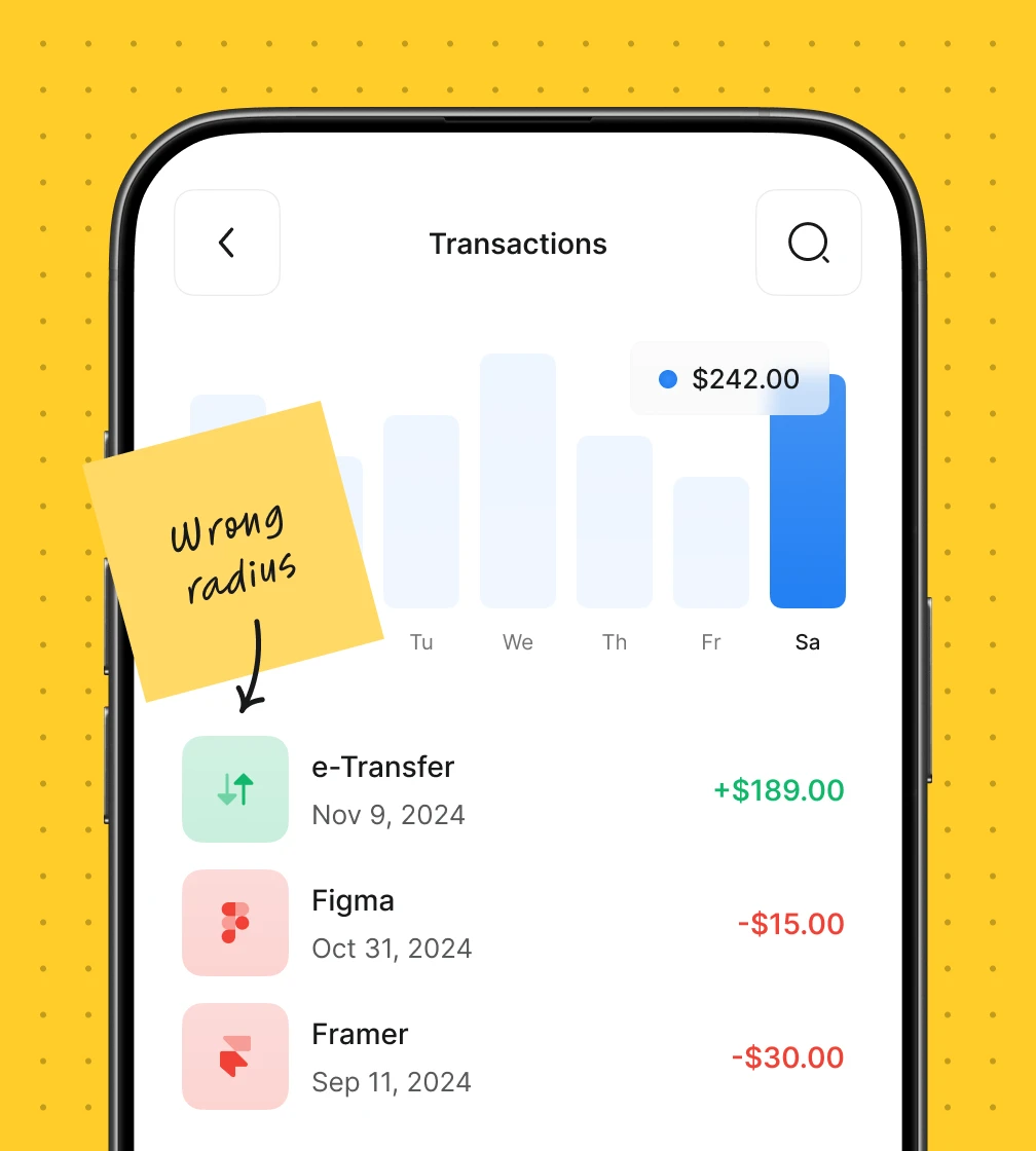
Redesigning components for enhanced usability
Next, I reimagined key UI components to boost usability and accessibility. By standardizing interactions across buttons, forms, and menus, I reduced friction and enabled users to complete tasks swiftly and intuitively, thereby increasing overall satisfaction.
Comprehensive documentation for seamless collaboration
I developed a detailed design system guide complete with usage guidelines, code snippets, and interactive prototypes. This centralized repository empowered designers and developers to implement components consistently, eliminating ambiguity and accelerating project timelines.
Establishing strong foundations
To address the inconsistencies, I proposed creating a robust foundation for the design system. This included defining standardized principles such as a color palette, typography scale, spacing system, and iconography library. By establishing these core elements, we aimed to create a unified visual language that could be applied across all products, ensuring consistency and alignment with the bank’s brand identity.
Redesigning components for enhanced usability
With the foundational elements in place, the next step was to redesign the existing components to improve usability. The focus was on simplifying interactions, ensuring accessibility compliance, and enhancing feedback mechanisms. By refining these components, we aimed to reduce friction and make it easier for users to complete their tasks efficiently.
Comprehensive documentation for seamless collaboration
A critical aspect of the solution was developing comprehensive documentation for the design system. This included detailed usage guidelines, code snippets, and interactive prototypes for each component. By providing a centralized repository accessible to all stakeholders, we aimed to eliminate ambiguity and empower designers and developers to collaborate more effectively.
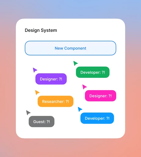
Meeting
Aligning cross-functional teams through a shared strategy
Meeting
Aligning cross-functional teams through a shared strategy
Meeting
Aligning cross-functional teams through a shared strategy

Manager
Guest
Developer
Designer
You
Manager
Guest
Developer
Designer
You
Manager
Guest
Developer
Designer
You
Presenting pain points and solutions to cross‑functional teams
In a dedicated meeting, I presented our identified pain points and proposed solutions to stakeholders from design, development, and management. This collaborative session fostered alignment, clarified expectations, and built consensus around our unified design system.
Foundations
Building the core elements of the scalable design system
Foundations
Building the core elements of the scalable design system
Foundations
Building the core elements of the scalable design system
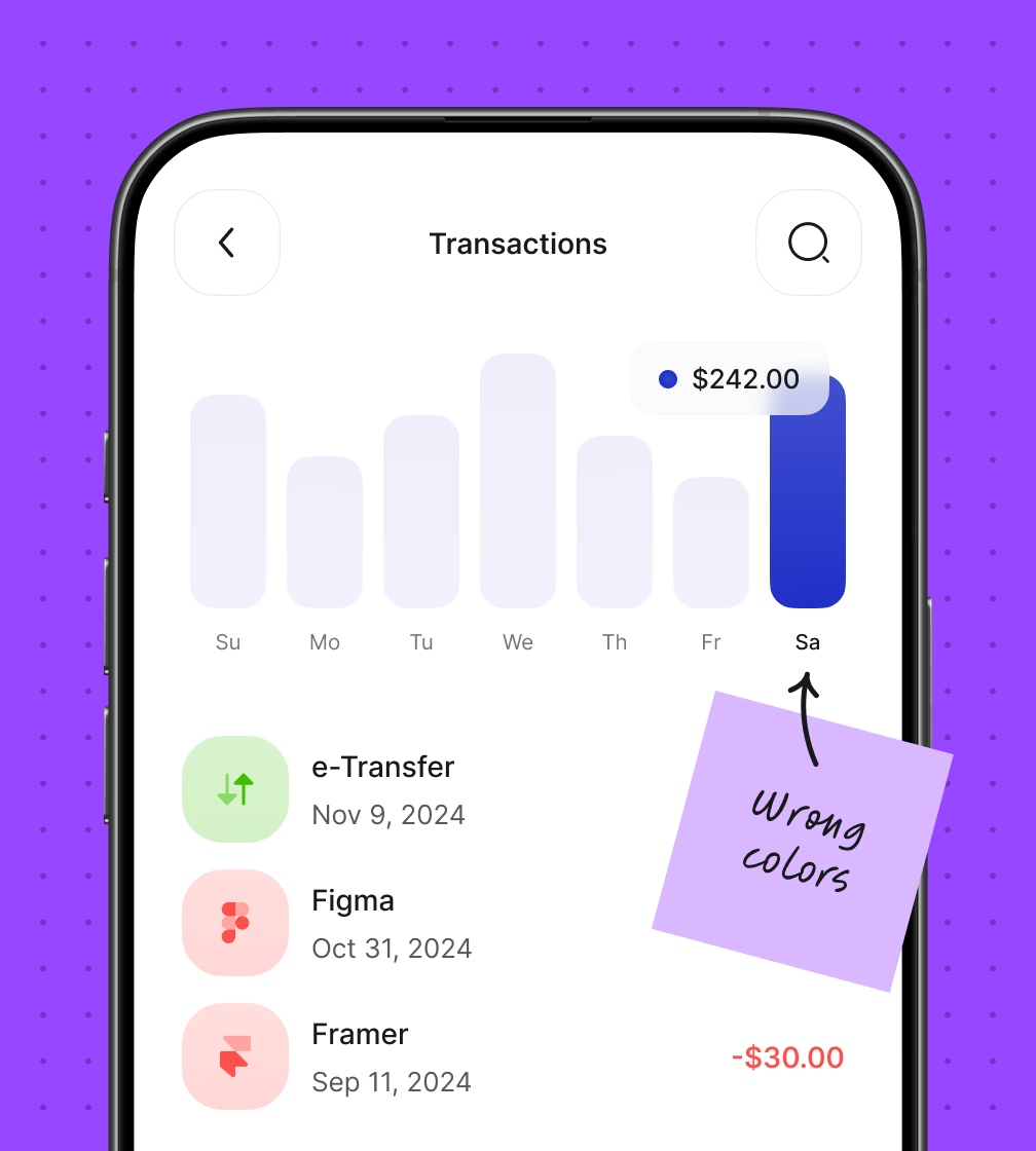
Colors: Designed as variables for flexibility and scalability
I crafted a flexible color palette using variables to assign roles for primary, secondary, and neutral tones. This structured approach ensures brand consistency across all platforms and enables seamless updates that preserve visual harmony.
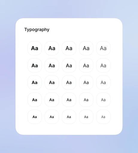
Typography: Establishing a clear typographic hierarchy for readability
I defined a clear typographic hierarchy by selecting typefaces, sizes, and spacing for headings, body text, and interactive elements. This structured approach enhances readability and maintains a cohesive look that reinforces SaderatBank’s professional image.
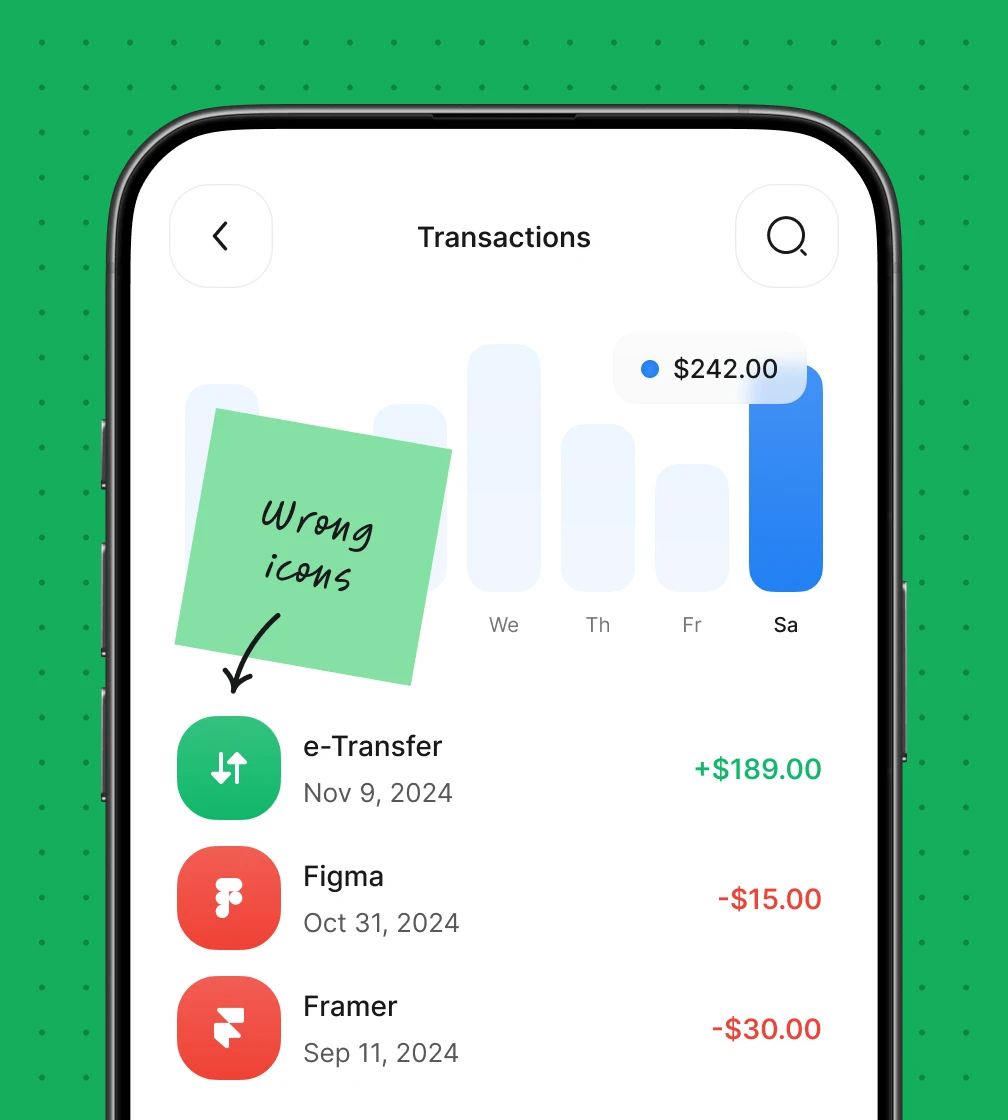
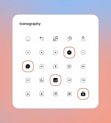
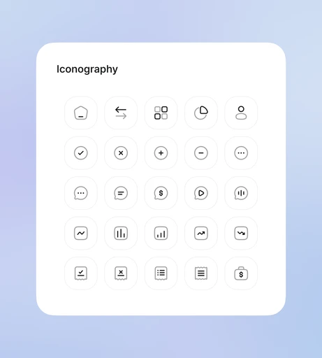
Iconography: A unified library for consistent and intuitive visuals
I developed a comprehensive icon library based on strict design principles. Each icon was meticulously crafted to reflect our brand personality, and detailed guidelines for size, style, and usage ensure a consistent visual language across all digital products.
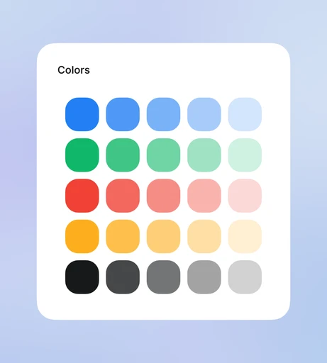
Colors: Designed as variables for flexibility and scalability
Lorem ipsum is a dummy or placeholder text commonly used in graphic design, publishing, and web development to fill empty spaces in a layout that does not yet have content.
Lorem ipsum is a dummy or placeholder text commonly used in graphic design, publishing, and web development to fill empty spaces in a layout that does not yet have content.
Typography: Establishing a clear typographic hierarchy for readability
The color palette was meticulously crafted using variables to ensure maximum flexibility and consistency. This approach allowed for seamless updates across platforms while maintaining brand integrity. Each color was assigned a specific purpose, such as primary colors for branding, secondary colors for interactive states, and neutral tones for backgrounds. By defining these variables, we ensured that any future changes could be implemented quickly and uniformly without compromising the visual harmony of the products.
Iconography: A unified library for consistent and intuitive visuals
A comprehensive iconography library was designed to provide a consistent visual language across all digital products. Each icon was carefully crafted to align with the bank’s brand identity and usability standards. Clear guidelines were established for their usage, ensuring uniformity in size, style, and meaning. This library not only streamlined the design process but also enhanced user comprehension by providing intuitive visual cues.
Components
Creating reusable and well-documented components
Components
Creating reusable and well-documented components
Components
Creating reusable and well-documented components
Variant 1
Variant 2
Variant 3


Variant 1
Variant 2
Variant 3
Variant 1
Variant 2
Variant 3
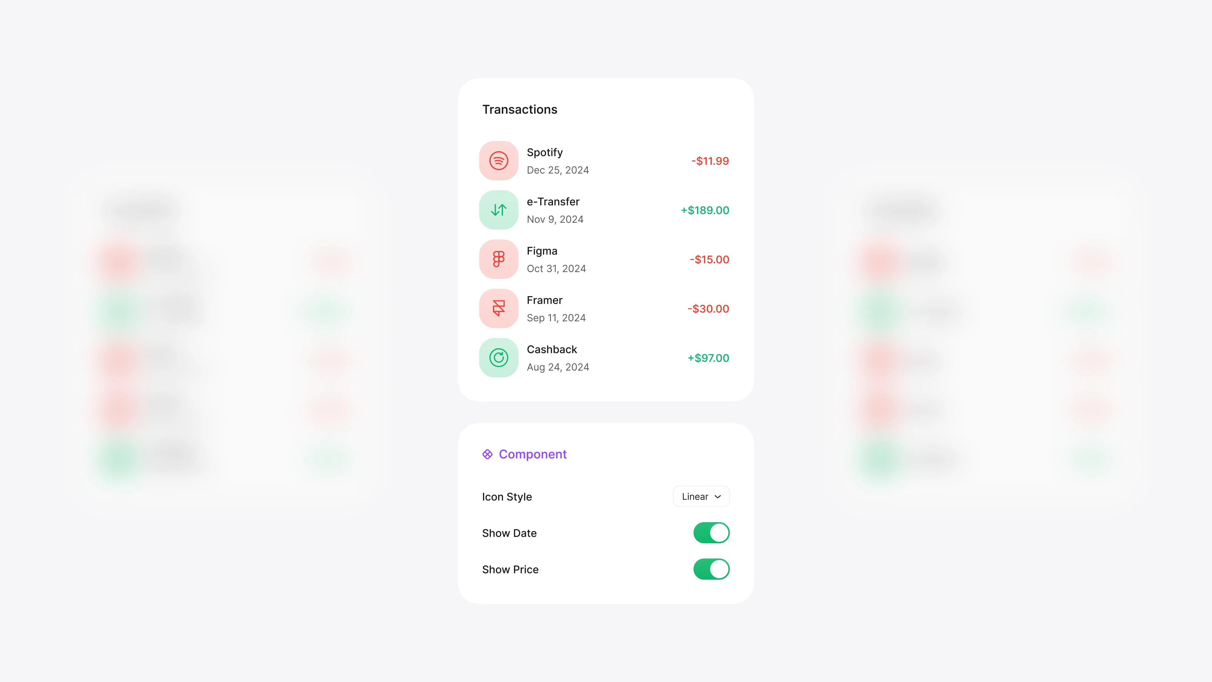
Components with comprehensive properties and variants
I designed a suite of reusable components with defined properties and multiple variants to address diverse use cases. Accompanied by thorough documentation, these elements enable our teams to implement designs consistently, significantly speeding up the design-to-development process.
Dark Theme
Enhancing user experience with a dark theme
Dark Theme
Enhancing user experience with a dark theme
Dark Theme
Enhancing user experience with a dark theme
Designing a functional and aesthetic dark theme
I introduced a dark theme to offer users an alternative visual option that reduces eye strain and improves readability in low‑light conditions. This carefully balanced theme maintains brand integrity while providing a modern, sleek look that appeals to various user preferences.
Final Design
The final design: Finalizing a cohesive and scalable system
Final Design
The final design: Finalizing a cohesive and scalable system
Final Design
The final design: Finalizing a cohesive and scalable system

Delivering a complete and future-ready design system
The final design system integrates robust foundations, refined components, and a dark theme into a cohesive, scalable framework that elevates user experience and accelerates development across all digital products.
Delivering a complete and future-ready design system
The final design system integrates robust foundations, refined components, and a dark theme into a cohesive, scalable framework that elevates user experience and accelerates development across all digital products.
Delivering a complete and future-ready design system
The final design system integrates robust foundations, refined components, and a dark theme into a cohesive, scalable framework that elevates user experience and accelerates development across all digital products.
Impact
From consistency to efficiency in creating a scalable design system
Impact
From consistency to efficiency in creating a scalable design system
Impact
From consistency to efficiency in creating a scalable design system
Streamlined design-to‑dev handoff
0
0
%
Increased speed by 50% through clear guidelines and reusable components.
Enhanced code reusability
0
0
%
Improved by 60%, boosting efficiency and consistency across projects.

